American Airlines
A global redesign for an efficient, intuitive flight check-in experience.
Role
Creative Director
What I Did
Product Design Strategy
Design Leadership
Design Direction
Contributors
Christina Nyugen White – UX Design
Elise Mattingly – Visual Design
Jessica Sutton – Visual Design
While at Sapient, American Airlines engaged us to reimagine their 10-year old, antiquated SSM Check-in experience for domestic travel – with the ability to scale for international screens – for use at airports worldwide.
Between cluttered screens, a flat visual hierarchy, and poor interaction patterns, many customers were struggling to complete their airport check-in in a timely manner, often requiring help from ticketing agents.
Our redesign goals were to reduce congestion at airport ticketing terminals, and increase user confidence and the ability to complete the check-in process unassisted.
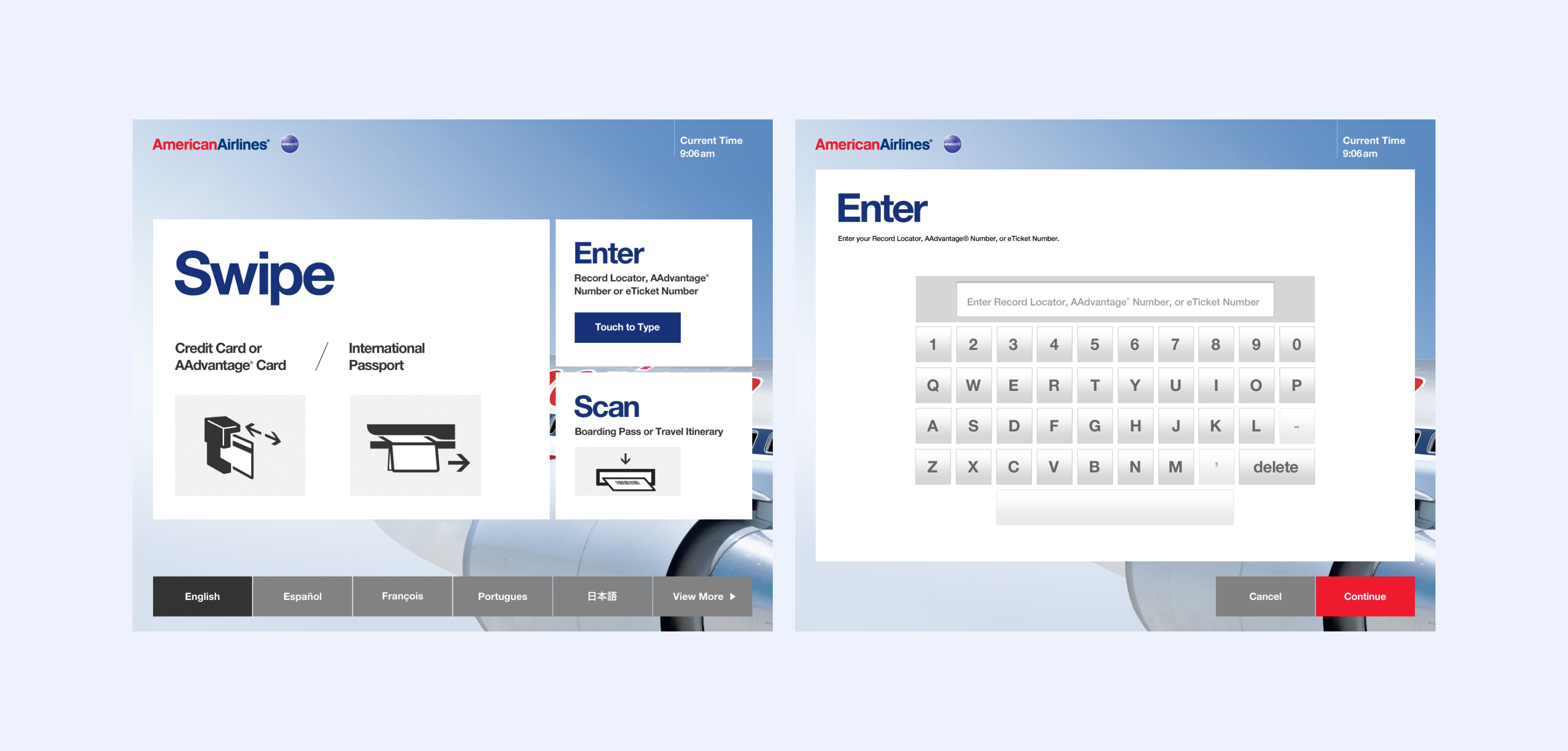
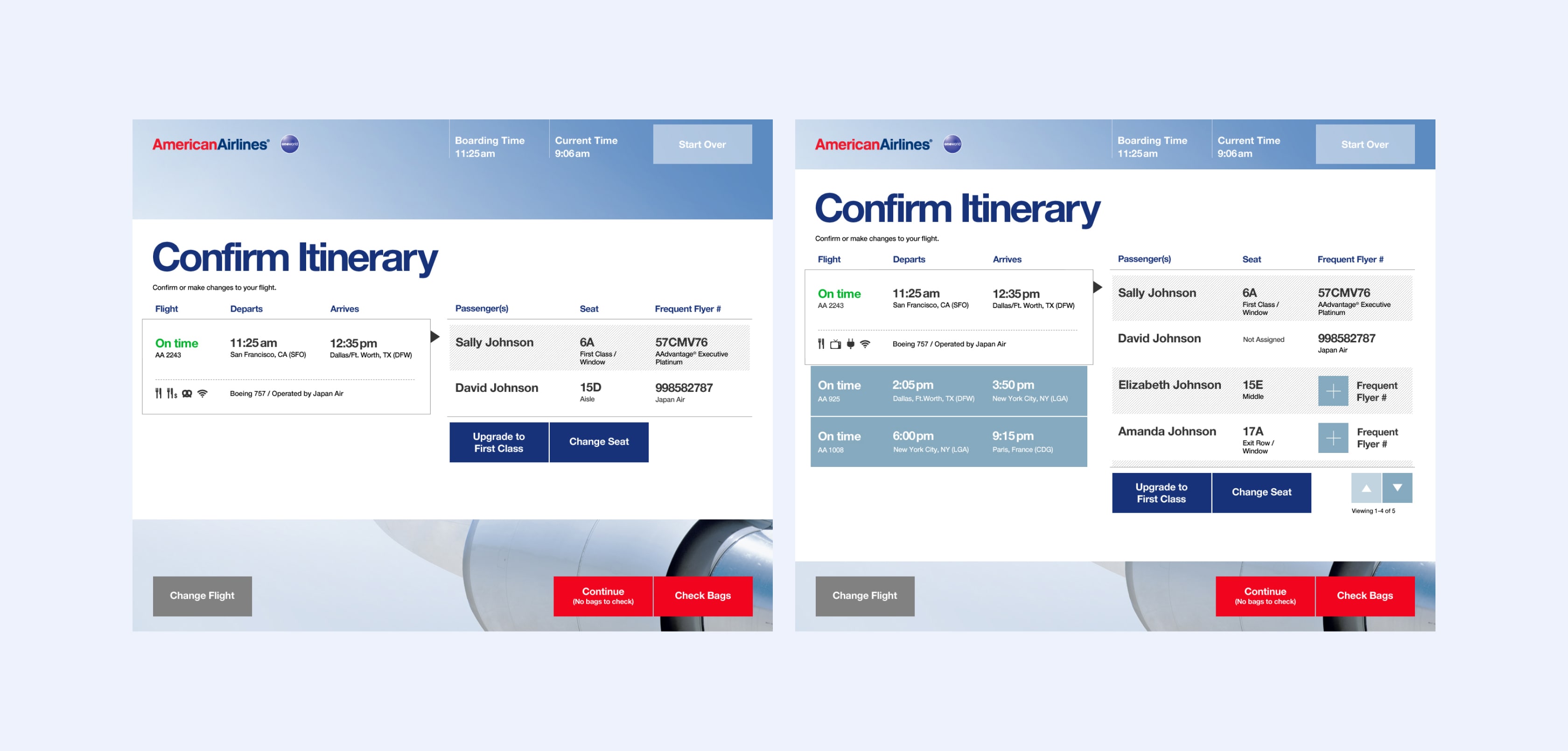
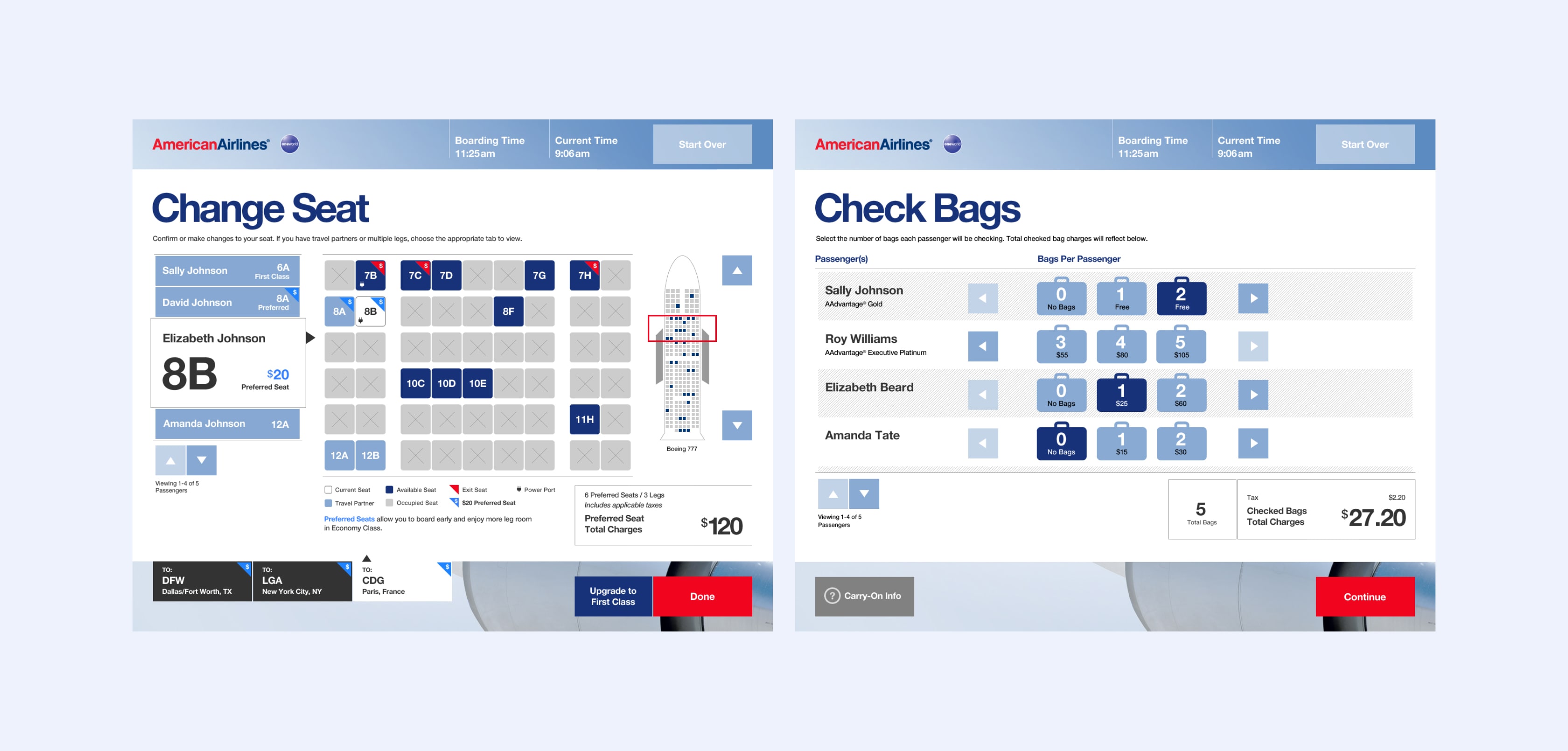
To reach our goals, we streamlined the check-in flow, created a clear structure and hierarchy, and limited the number of tasks on each screen to keep the user focused and moving forward.
During the project, we faced hardware and software limitations, a highly political climate to navigate, and senior leaders who were still getting up-to-speed in new roles.
Inside of three months, we completed Discovery, Design, and User Testing phases. American Airlines launched the SSM Check-In to airports worldwide, which was live until their eventual rebrand a few years after.
Impact
60% –– Reduction of steps to complete the domestic check-in flow
00:48 –– Average time to complete the new core check-in flow; down from 02:12 in the previous product
User Research
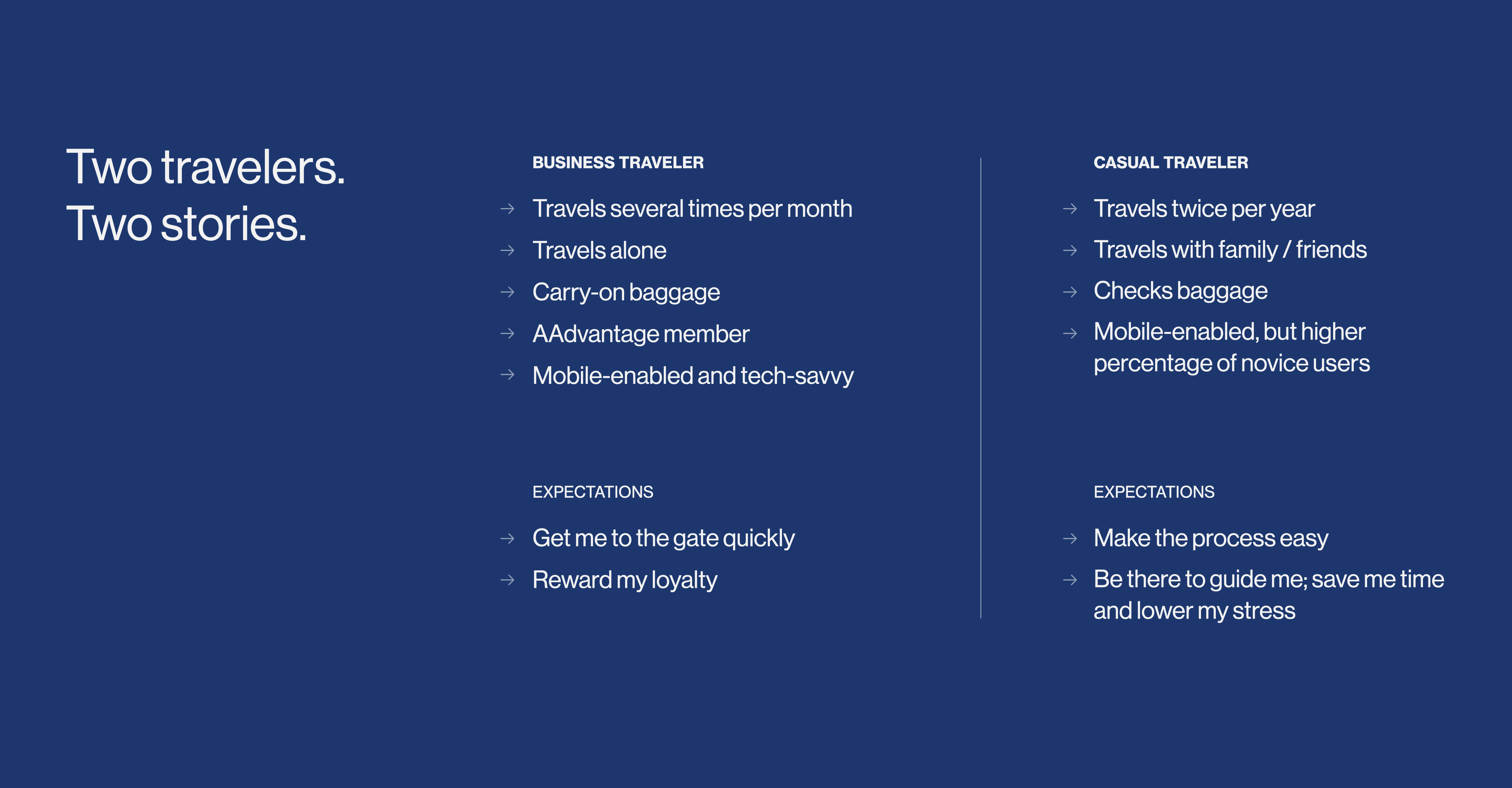
We conducted user interviews with road warriors and occasional travelers alike, and visited airports to observe the check-in experience at both peak and off-peak hours.
The Current Product
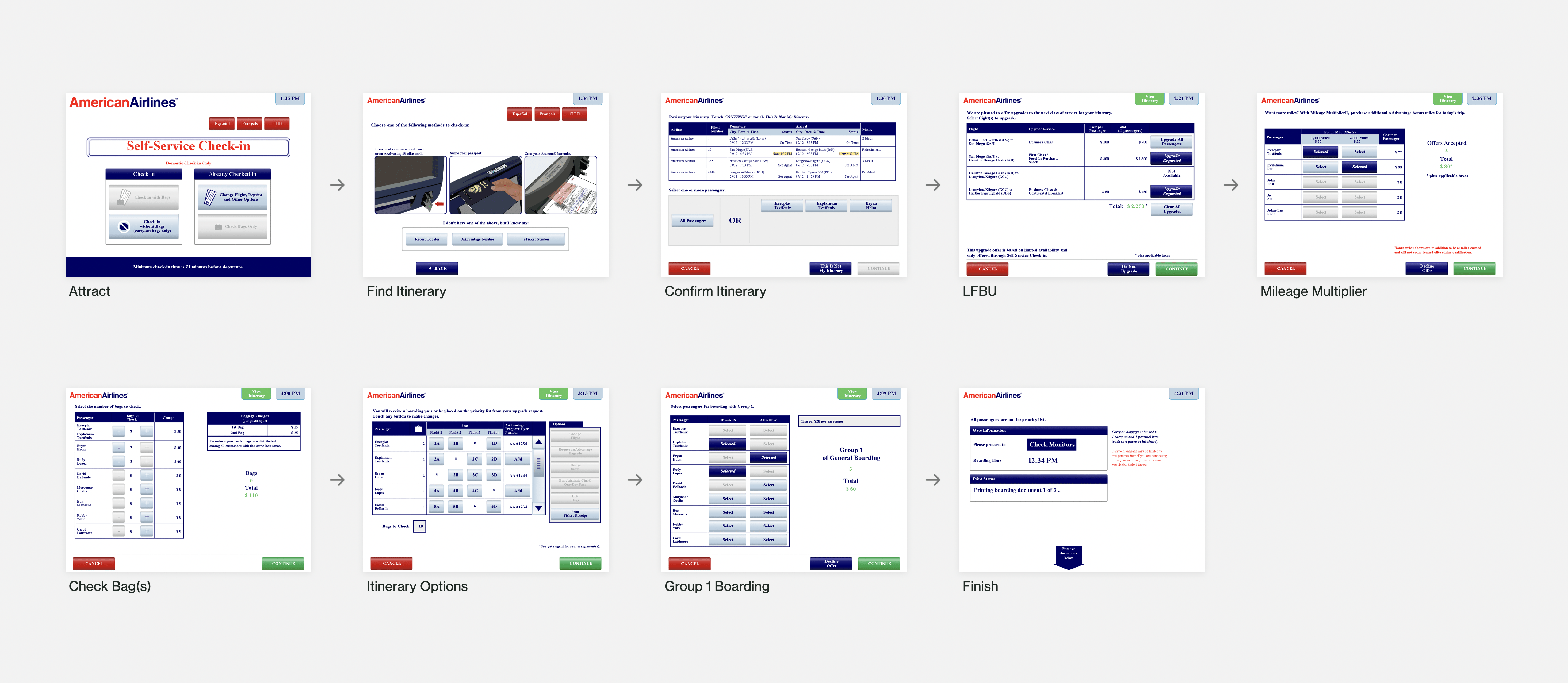
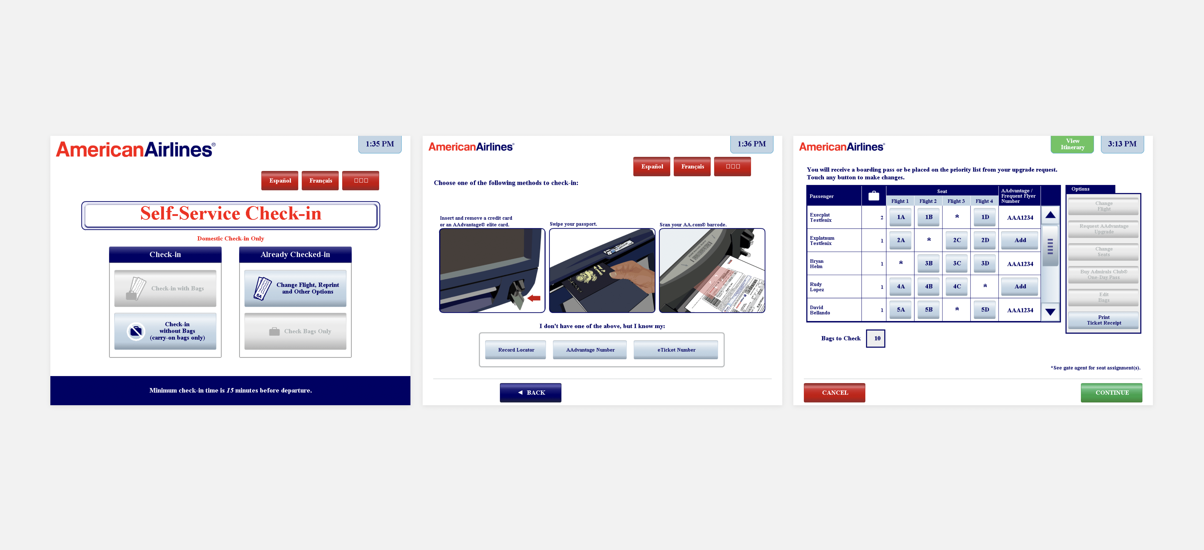
Nearly half of the nine required screens were non-essential, lacked hierarchy, and were attempting to perform multiple jobs. The user sometimes had up to six competing calls-to-action, and UI that looked like buttons but were untappable.
Streamlining the Flow
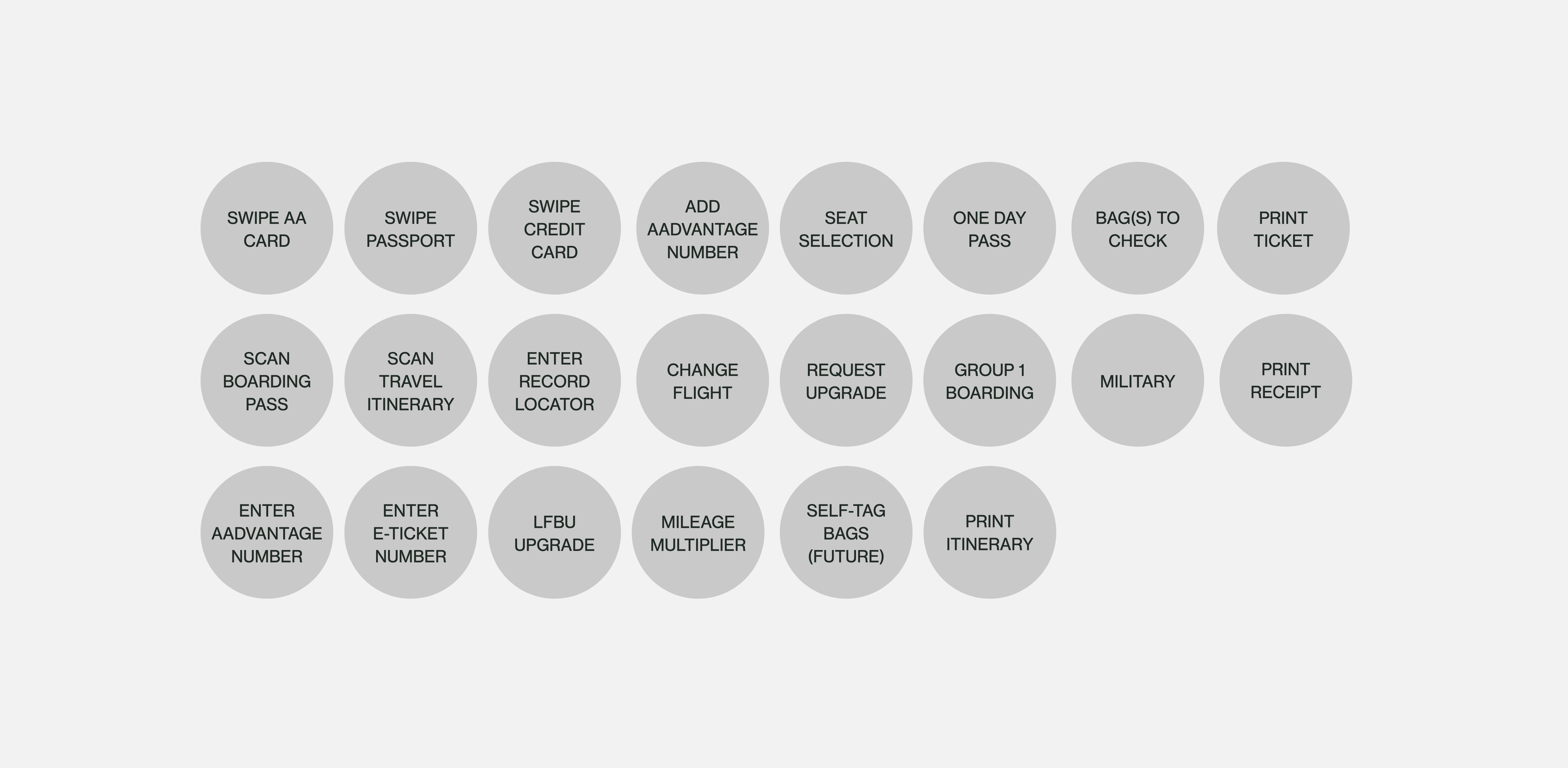
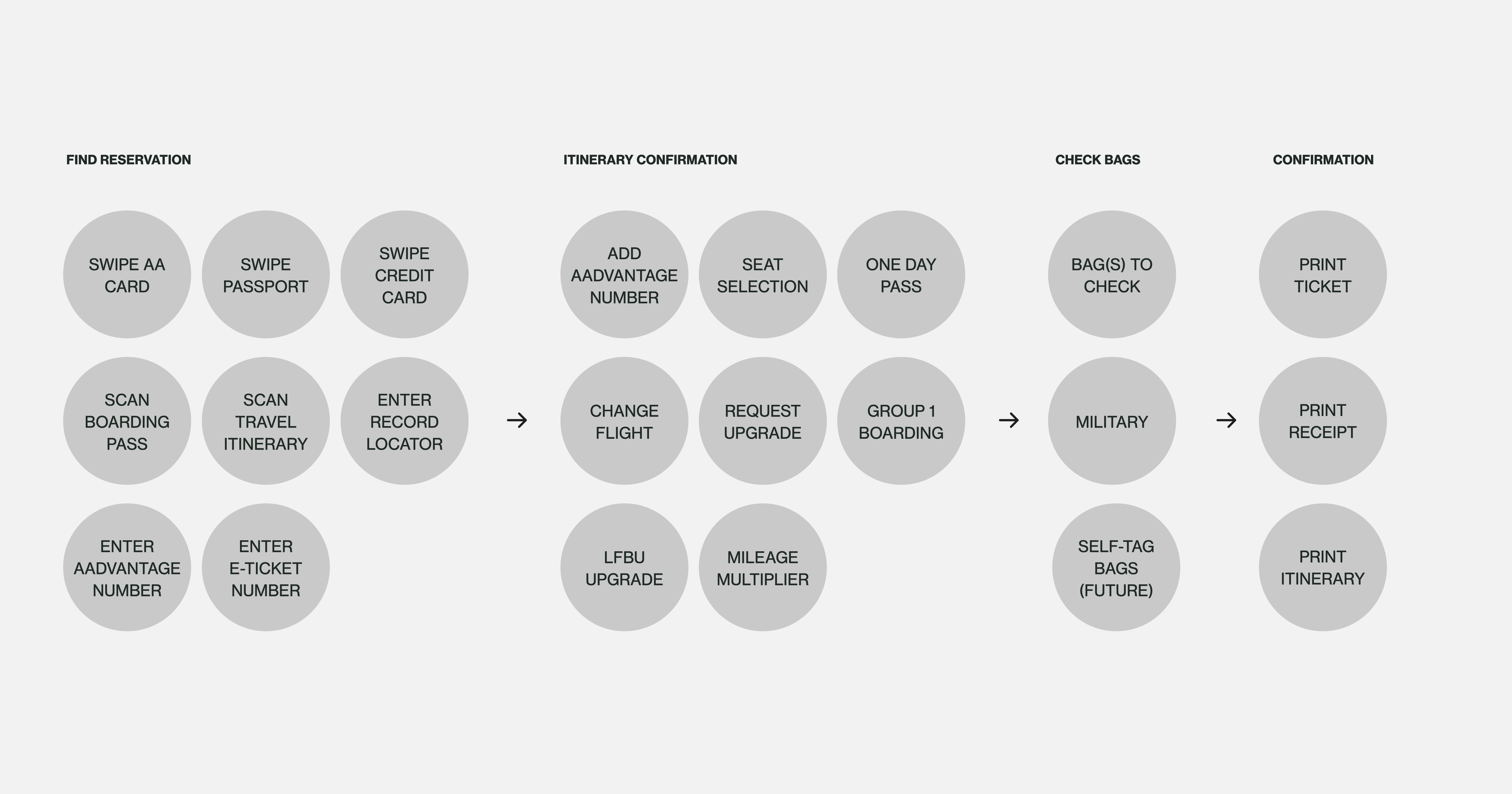
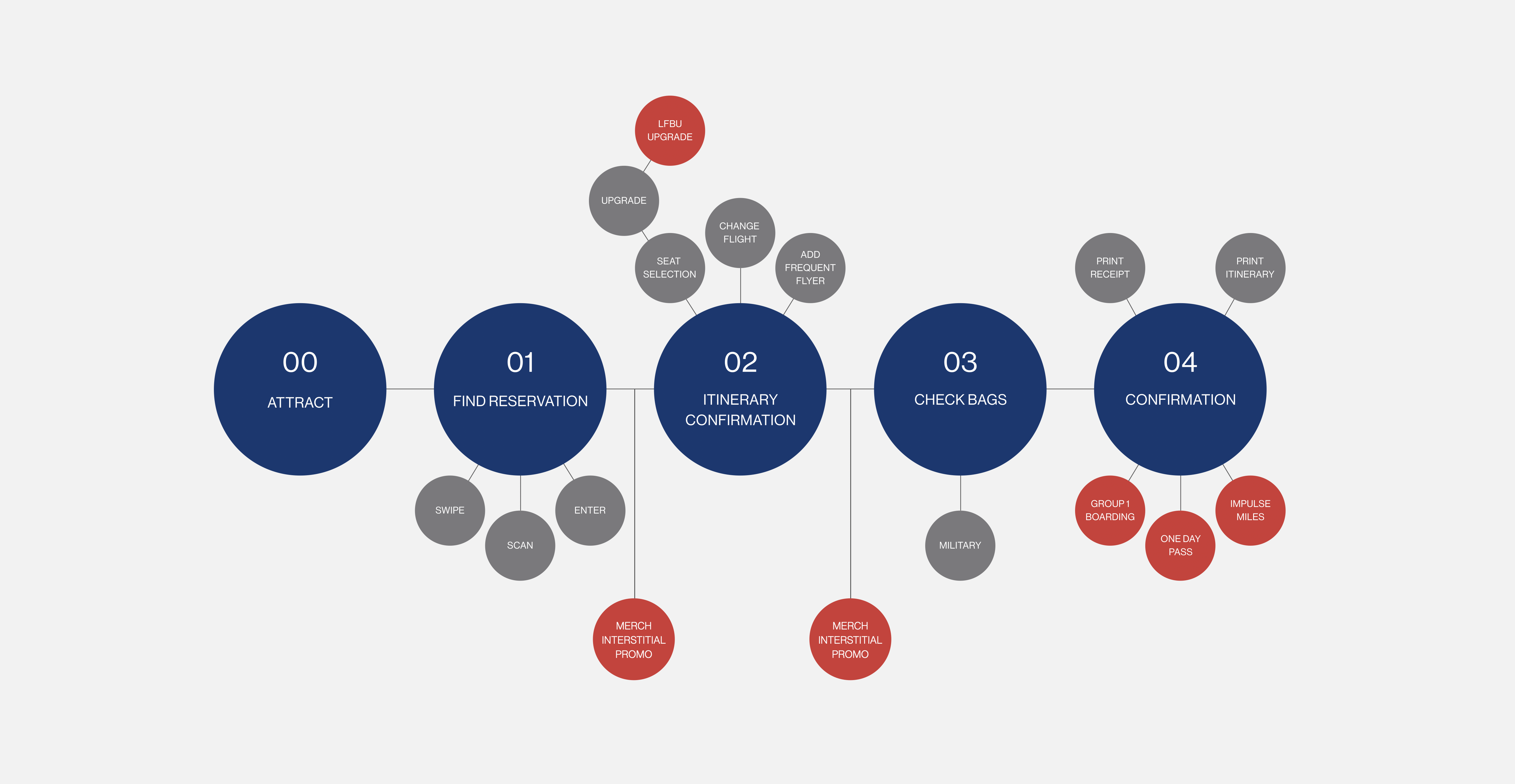
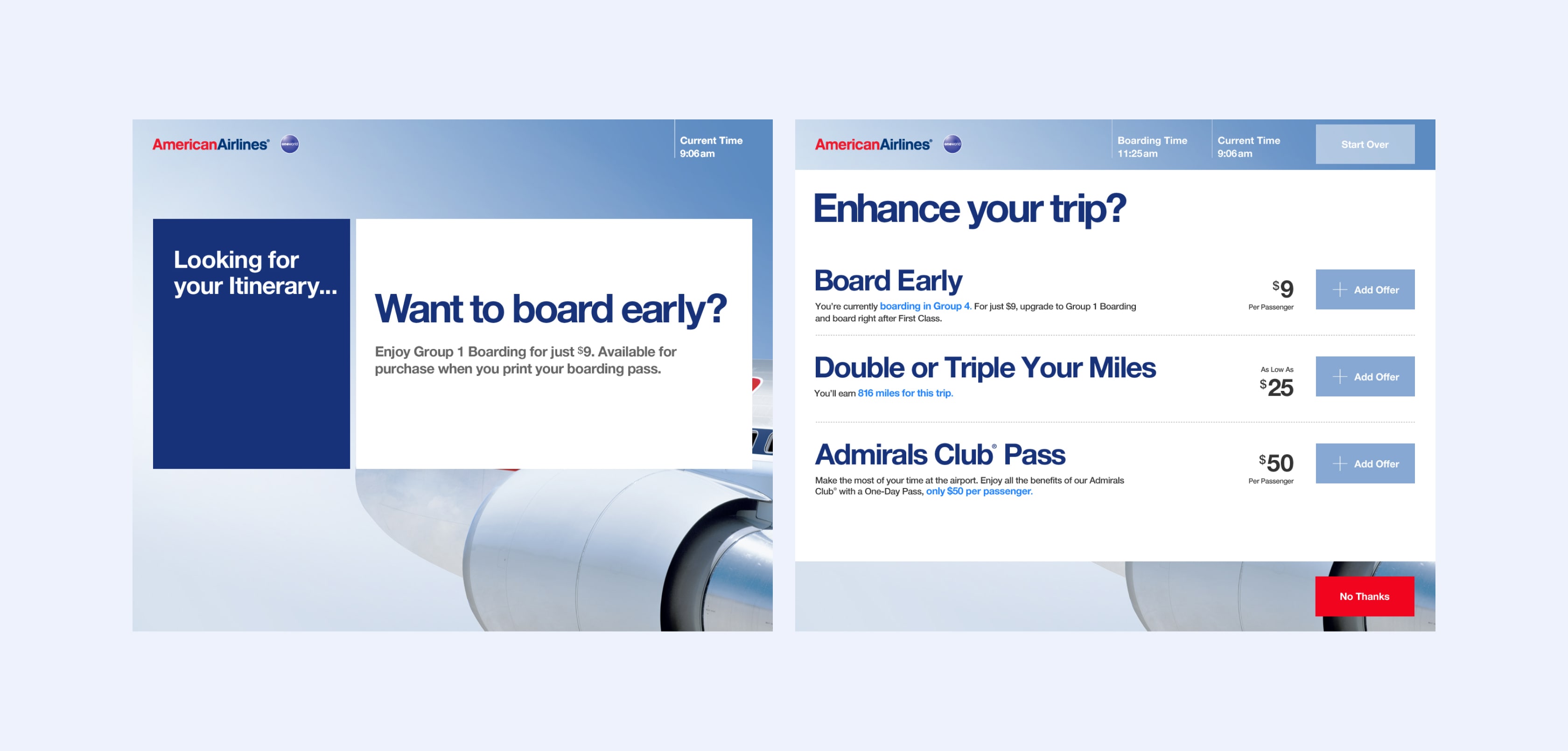
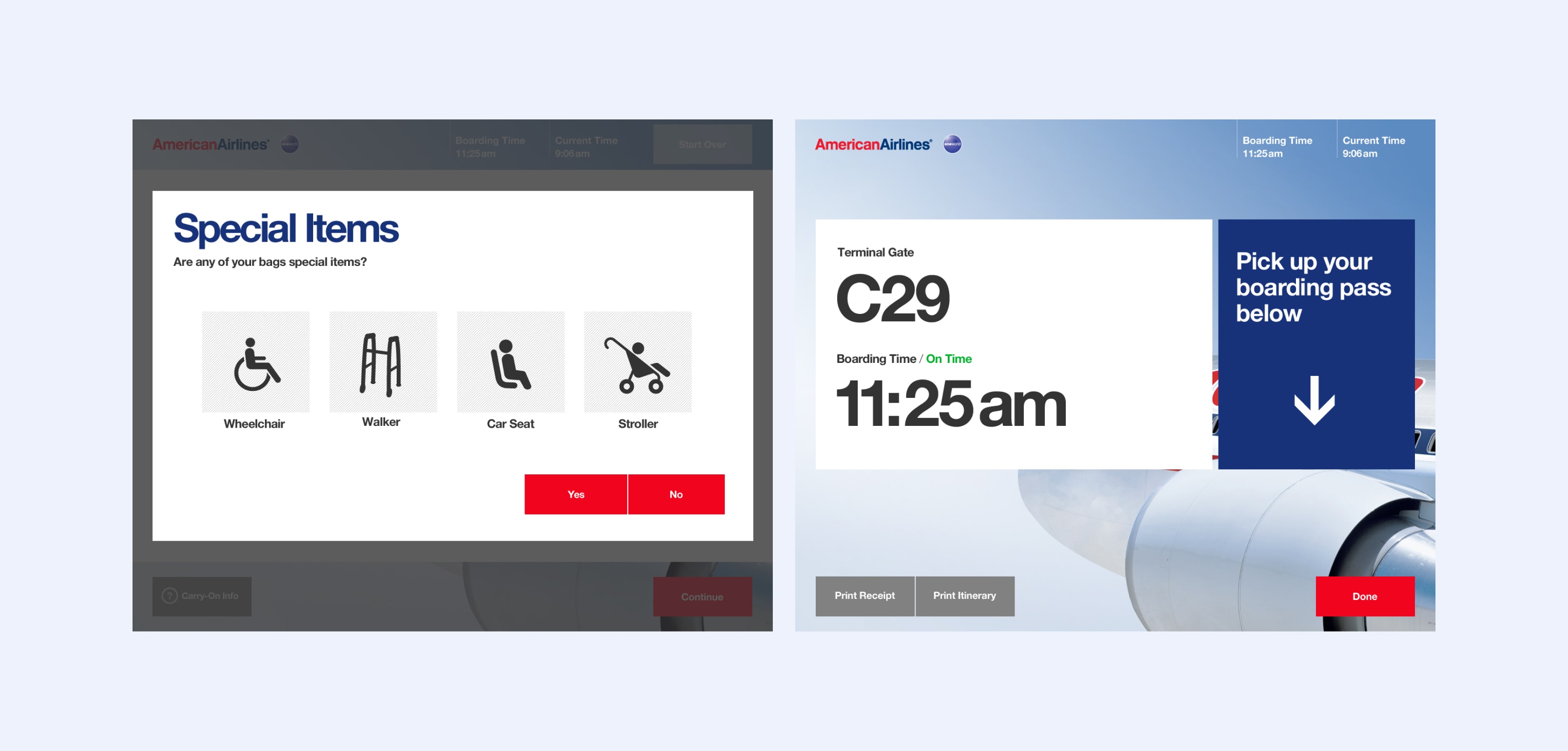
We organized the steps into four primary categories: 1) Find Reservation, 2) Itinerary Confirmation, 3) Check Bags, and 4) Confirmation, with tangential secondary tasks available for users with interest and time.
Design Directions
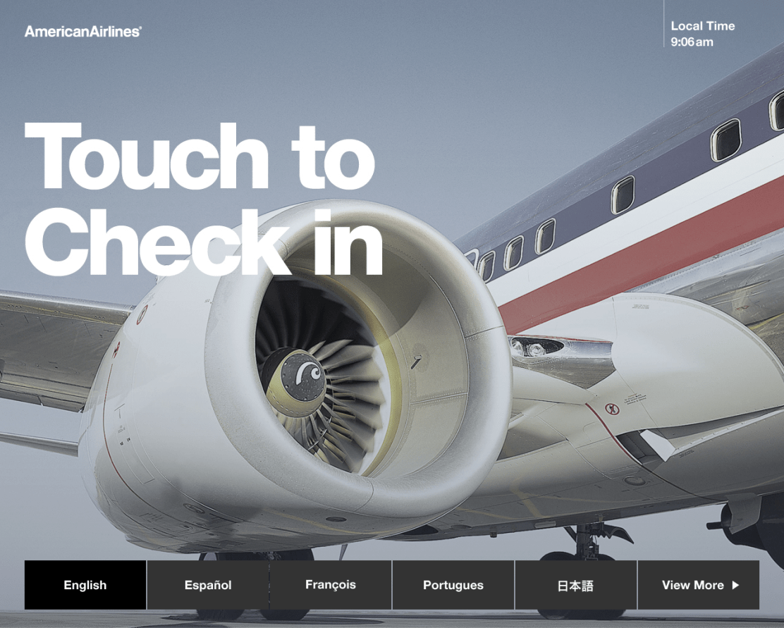
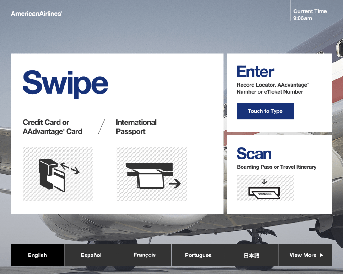
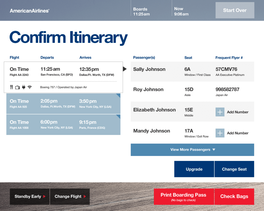
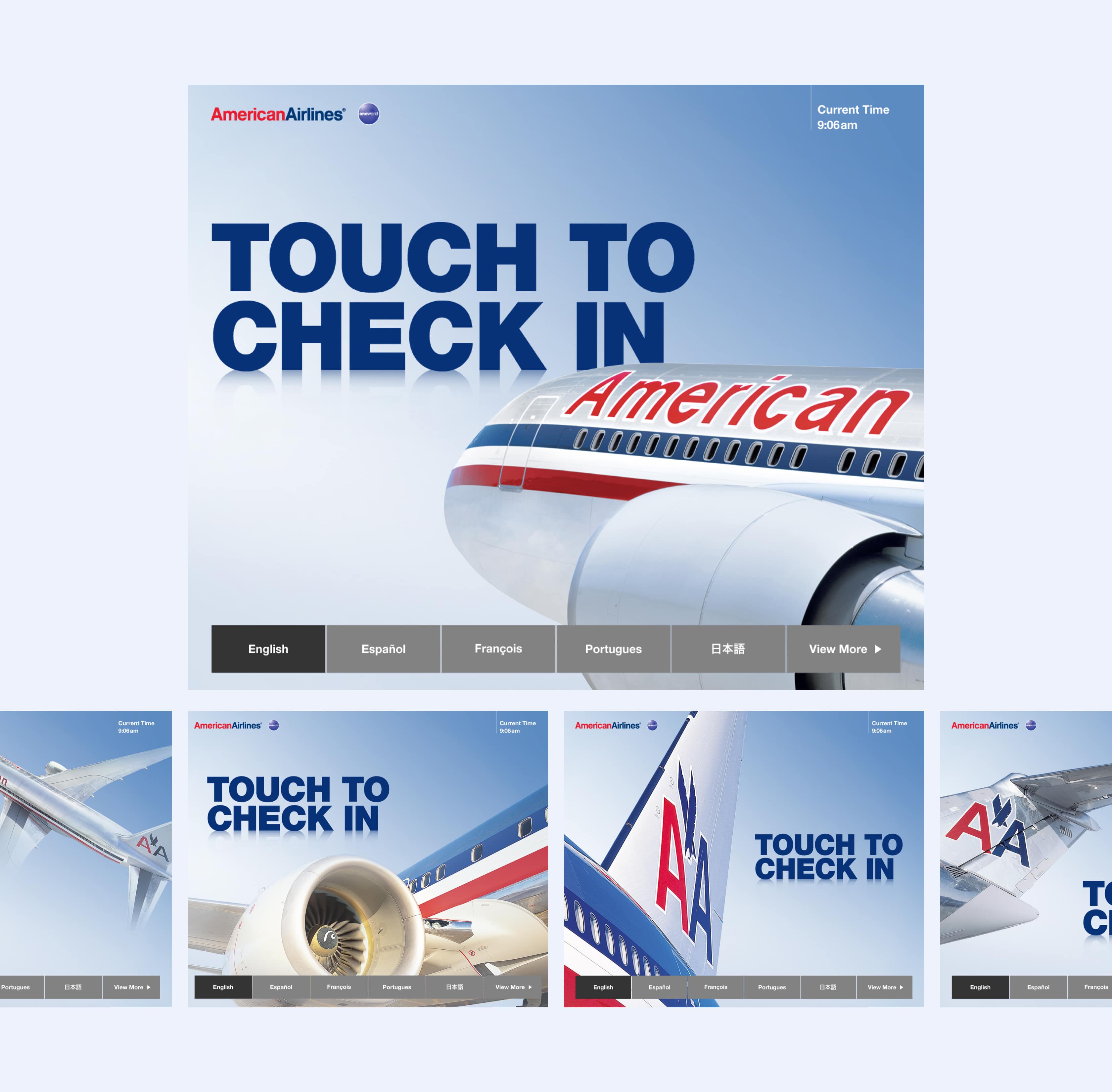
Design Direction 01—We created dramatic crops of the aircraft, along with a muted steely-blue background and complemented with white content cards.
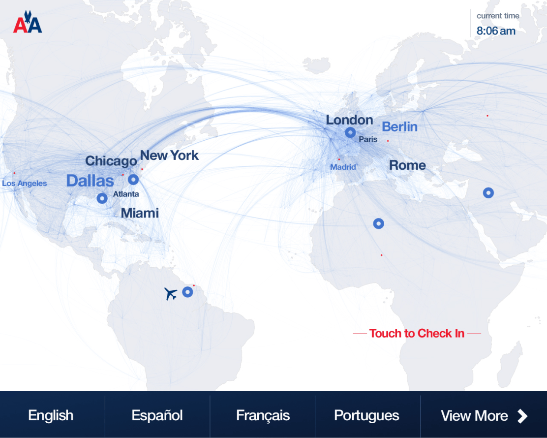
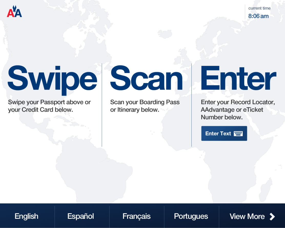
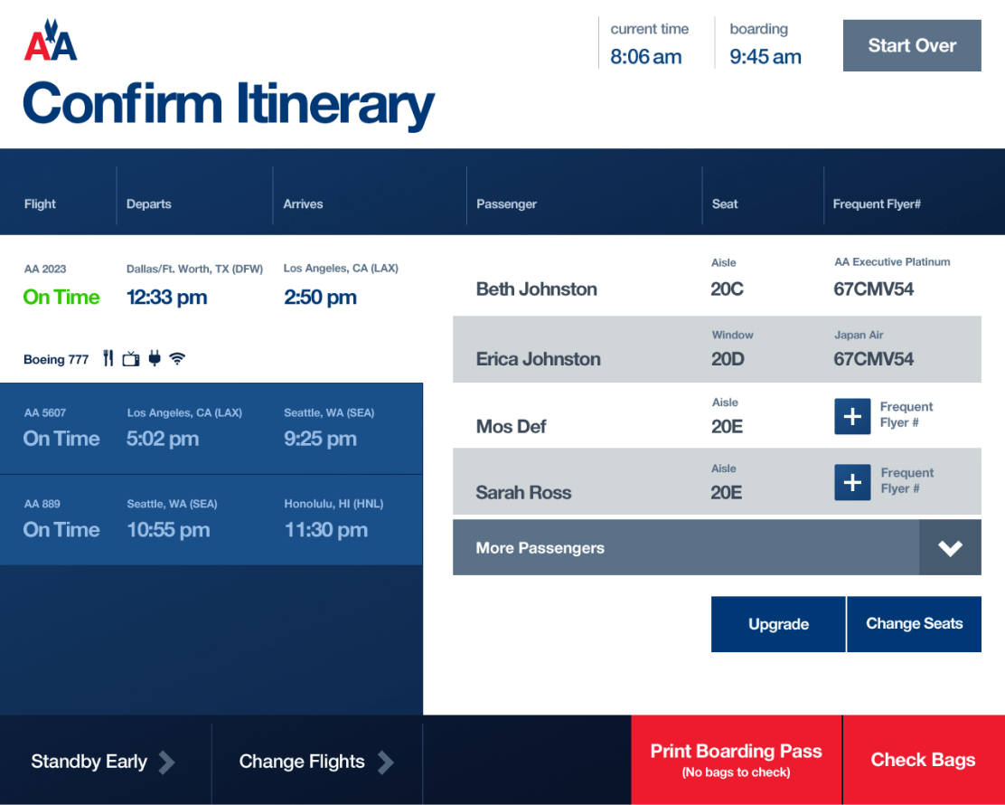
Design Direction 02 –– This direction focused on the destination, with attract screens that diplayed real-time American flights to make the check-in experience feel both dynamic and connected. Bold, oversized labels were proposed for decision points, and color blocks were used to denote sections and screen hierarchy.
Final Design
About
James Witcher is a Product Designer & UX Leader who blends strategic leadership with hands-on expertise to shape, craft, and ship digital experiences that people love and rely upon.
Work
James Witcher
Product & UX Design Leader
jameswitcherdesign@gmail.com
LinkedIn
+1 404 630 1135
© 2025