American
Airlines
Product Design Strategy
Design Leadership
Creative Direction
A global redesign for a better way to check in.
American Airlines engaged us to reimagine their 10-year old, antiquated SSM Check-in experience for domestic travel – with the ability to scale for international screens – for use at airports worldwide.
Our goals were to 1) reduce congestion at airport terminals during peak travel days and times, 2) increase the user's confidence and ability to complete check-in unassisted, and 3) to minimize the need for ticketing agent customer assistance.
Leading design for the pitch team, I had already presented preliminary concepts and felt that we had traction from the beginning. However, soon after beginning the work, we learned that there would be many challenges to overcome. There were considerable constraints in regards to hardware and software, and a harsh political climate to navigate.
Impact
60%
Reduction of steps to complete the domestic check-in flow
48s
Average time to complete the new core flow; down from 2m:12s in the previous flow.
Overcoming headwinds
Constraints, ambiguity, and internal politics
Out with the old, and in with the... old
While American seemed open to explore how far we could push the design, they were not willing to update the hardware. Therefore, the new experience would be running on 10-year old, low performance PCs running Flash at 1280x1024 resolution.
Stakeholder knowledge
A few of our key stakeholders, including one at the c-suite level, were new in their role. This led to somewhat shallow information gathered from stakeholder interviews.
Getting a clear line of site
My team was hired by, and aligned with, the client Product team. After the first few preliminary design reviews, I realized that what we were asked to do and what was being accepted were in direct conflict. This was due to the project being managed by Product, but the budget (and ultimately, the final say) came from the Merchandising team.
Product silos
The client product teams conducted their work in silos. Each team operated with autonomy, which translated to a lack of consistency across product experiences. Additionally, the teams were competitive, and were hesistant to share information with others.
Making allies
The client's in-house UX team kept their distance at first. They posessed a deep understanding of AA's digital landscape, but their recommendations had largely been ignored within the organization.
Brand management
The brand manager lacked nuance, and was introduced as a project gatekeeper... at the end of the project.
Building a path to success
In order for the team and the project to be successful, I established some ways of working to help guide us.
Find common ground with AA's UX team
The in-house UX team had considerable knowledge, but no voice in the organization. My team had the attention of Product, but lacked on-the-ground knowledge. I set up a meeting with the team, established a working relationship, and built a partnership for the remainder of the project.
Have a direct path to all stakeholders
After receiving conflicting direction and feedback, we realized that Merchandising was the end client. As soon as this was discovered, I worked with both our Product partner and the Merchandising org to have representation at all design working sessions and reviews. This way, all feedback could be shared and addressed first-hand and in the room.
Keep the team focused
I was fortunate to work with such a strong team of UX and visual designers. I also saw how some of the client politics were starting to affect the attitudes and work from the team. I acted to separate the team from the sometimes harsh environment, and to keep them focused on delivering a great experience. While they attended all client reviews, I took some of the more contentious meetings myself.
Design for the extremes, and we'll win the middle
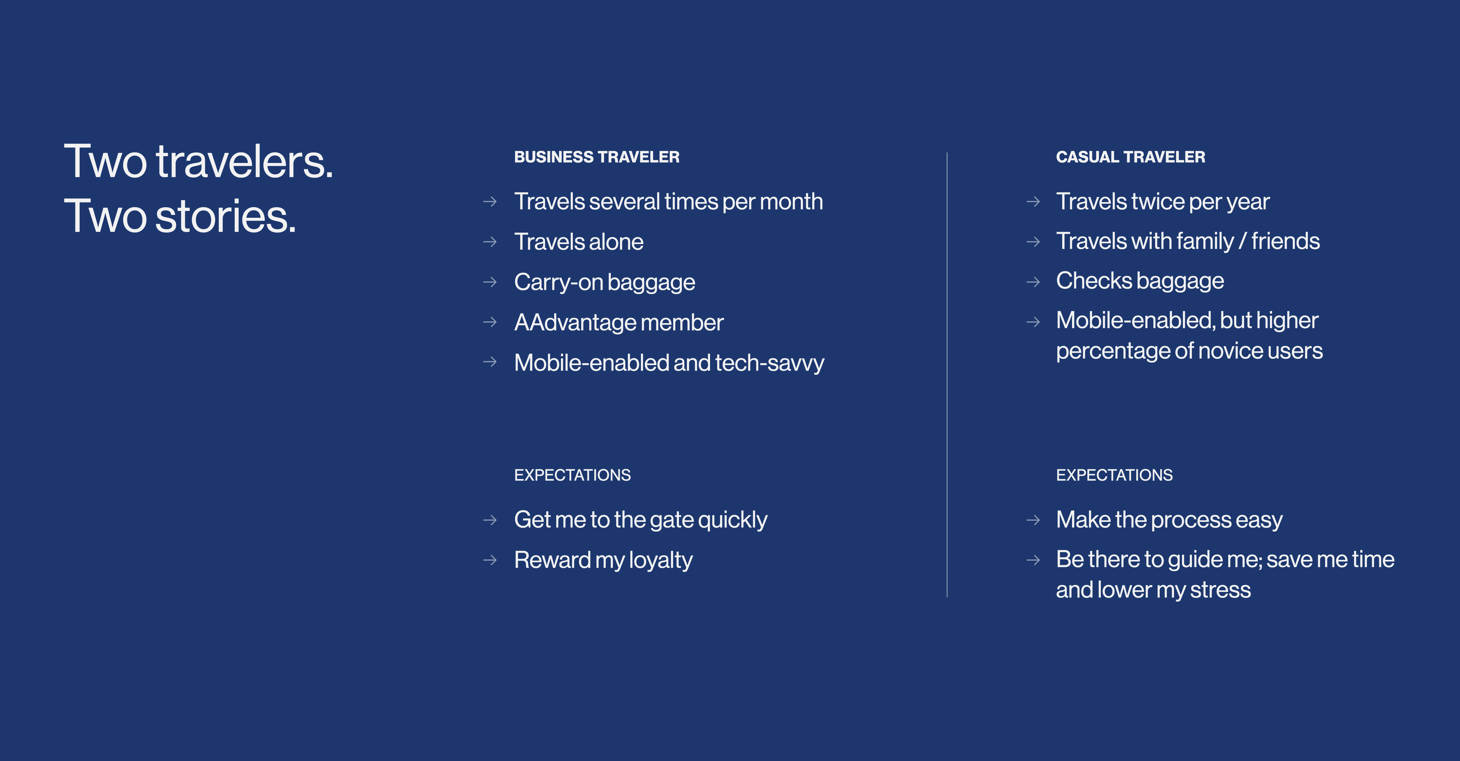
To begin our research, we established the two ends of the traveler spectrum: the rare traveler and the road warrior. We realized that, if we could design a great experience for each of them, then we could satisfy the users in between.
Guiding principles
I facilitated a set of principles to keep both the team and our clients focused on a north star. We began every client session with a review of these principles, and leveraged them to evaluate and align on direction and feedback throughout the process.
Guiding principles
Research & discovery
We prepared and led user interviews with road warriors and occasional travelers alike. We stood at Hartsfield Jackson, the busiest airport in the world, and watched people check in.
We watched others try.
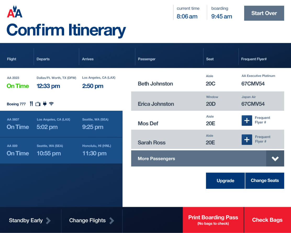
A complex experience to navigate
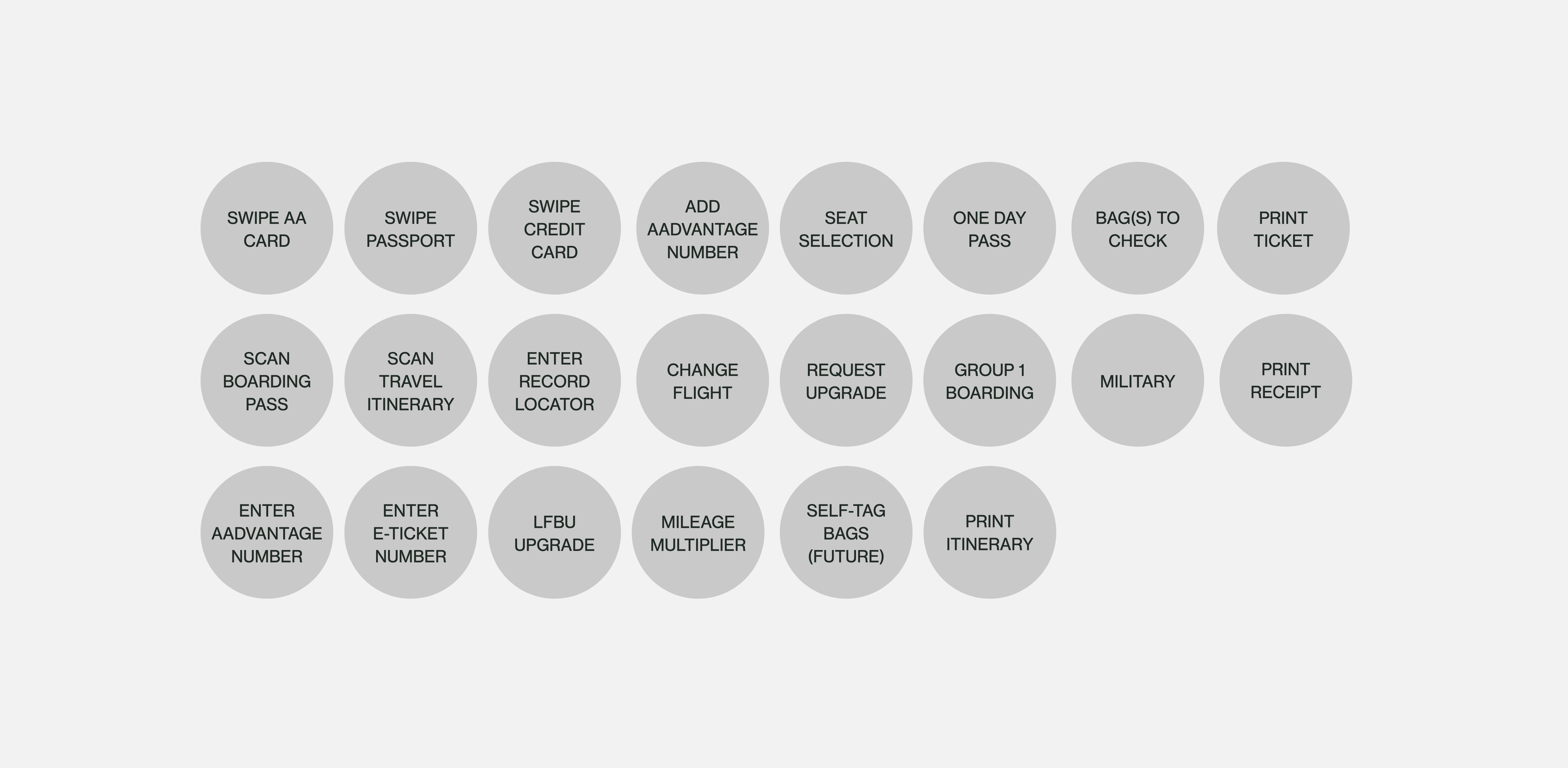
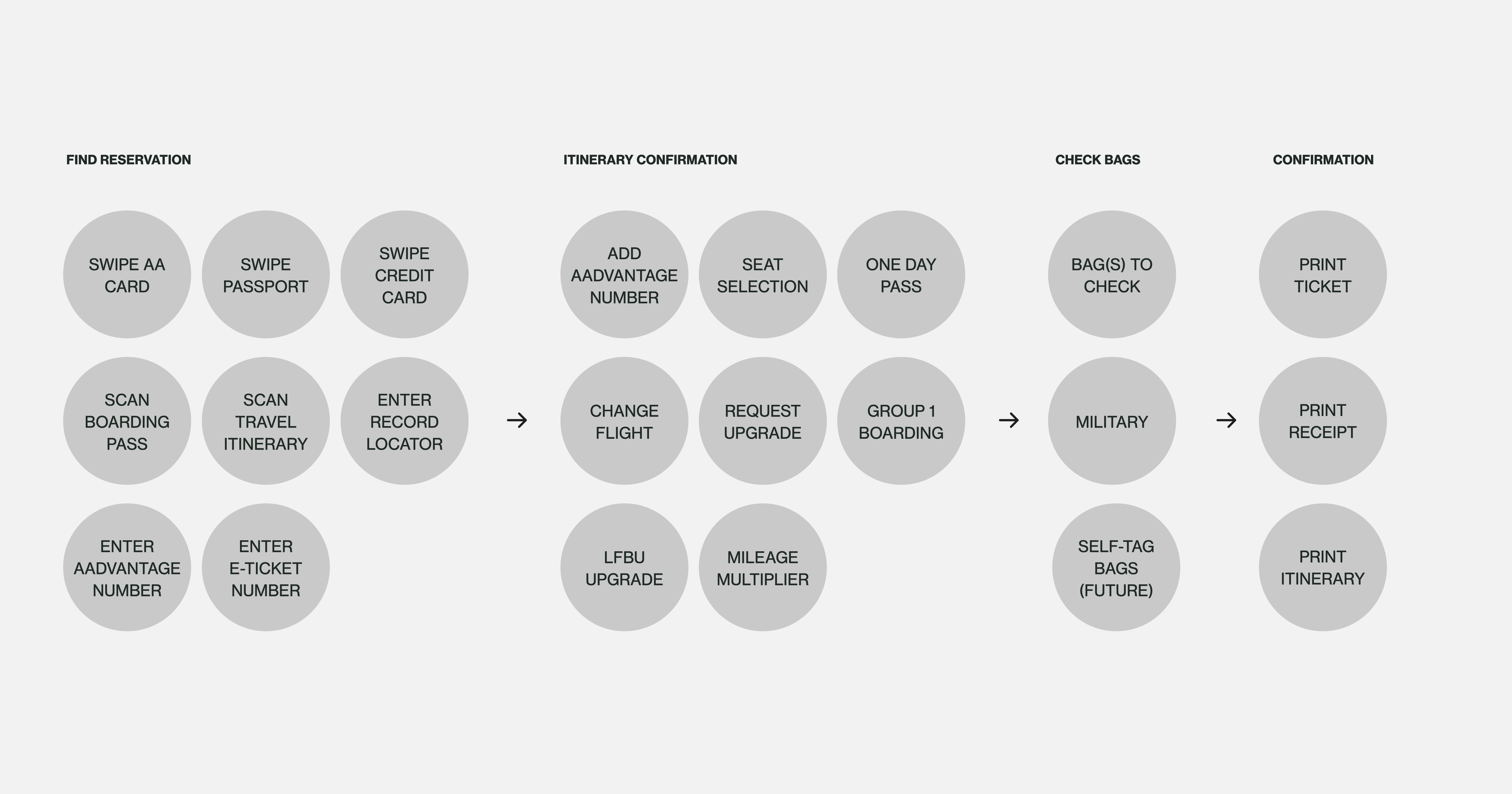
The domestic check-in experience consisted of nine required screens, with a total of 107 possible screens depending on variables such as domestic vs. international travel, error states, etc. Nearly half of the screens were dedicated to merchandising, and not necessary to fullfill check-in requirements.
Most screens lacked hierarchy, contained poor visual cues for interaction, and tried to perform multiple jobs.
Streamlining the flow
There were multiple ways to approach, what should have been, a simple process for domestic check-in. And trying to ingest too much information at one time was taxing for travelers unfamiliar with the process or dealing with the stress of running low on time.
Organize, simplify, and pace
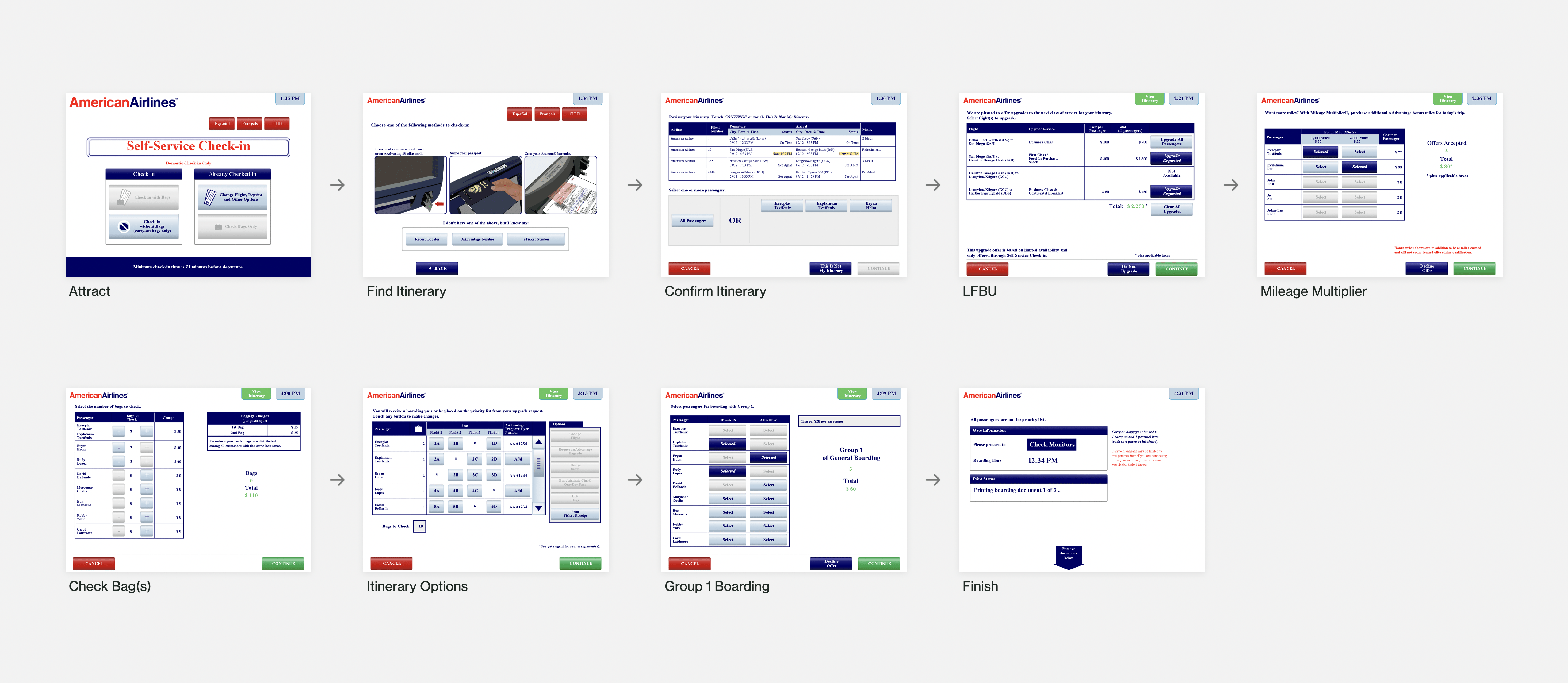
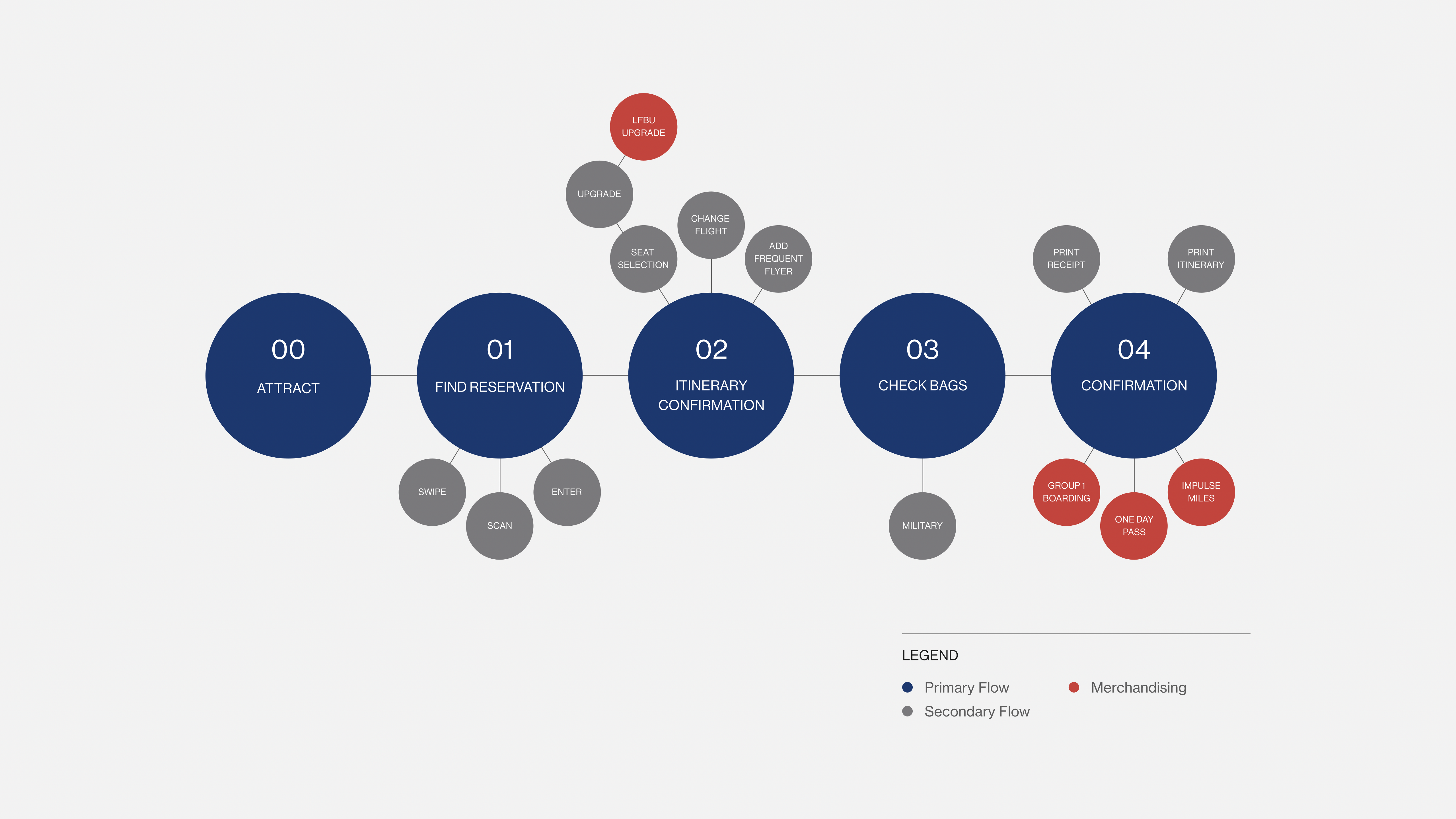
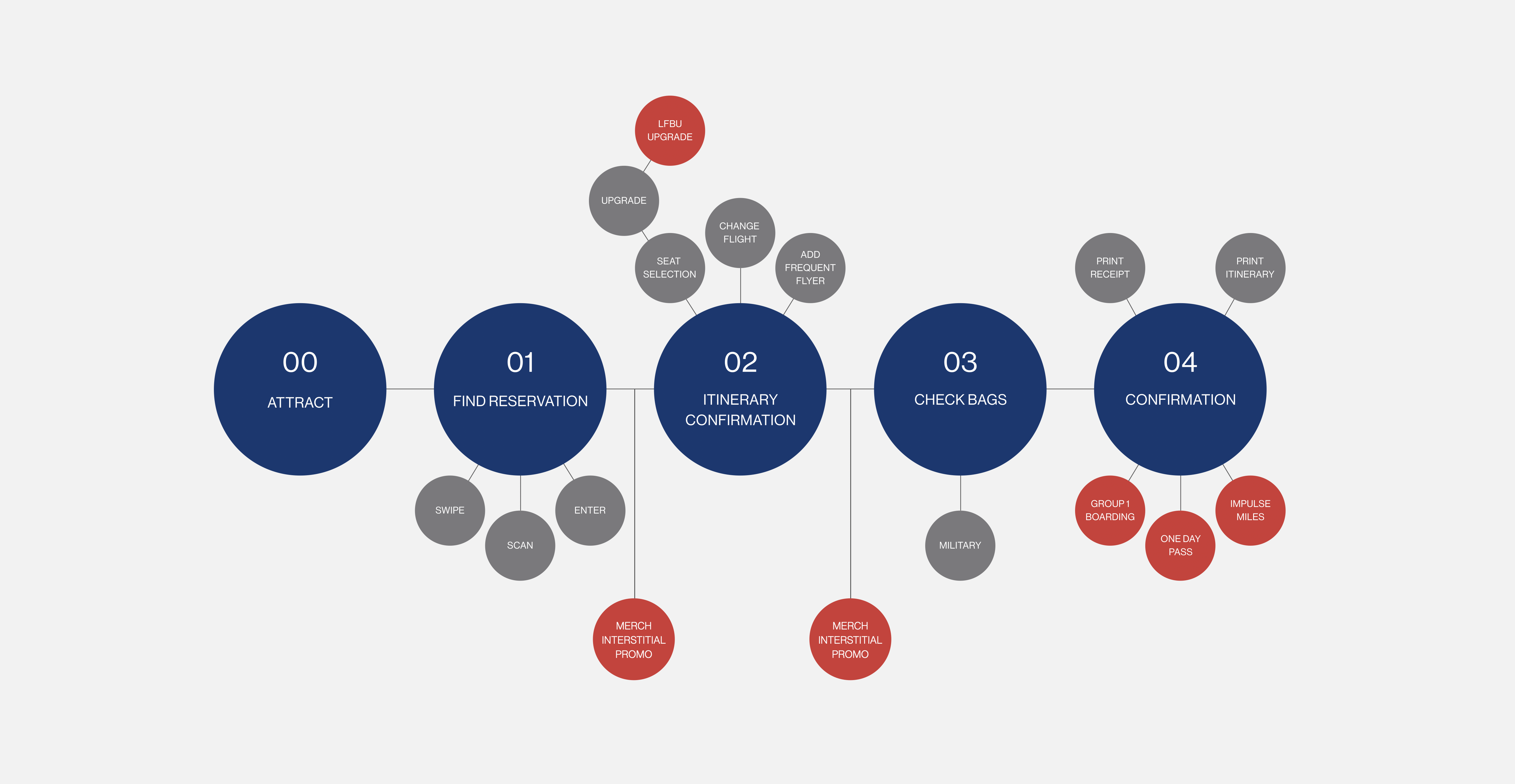
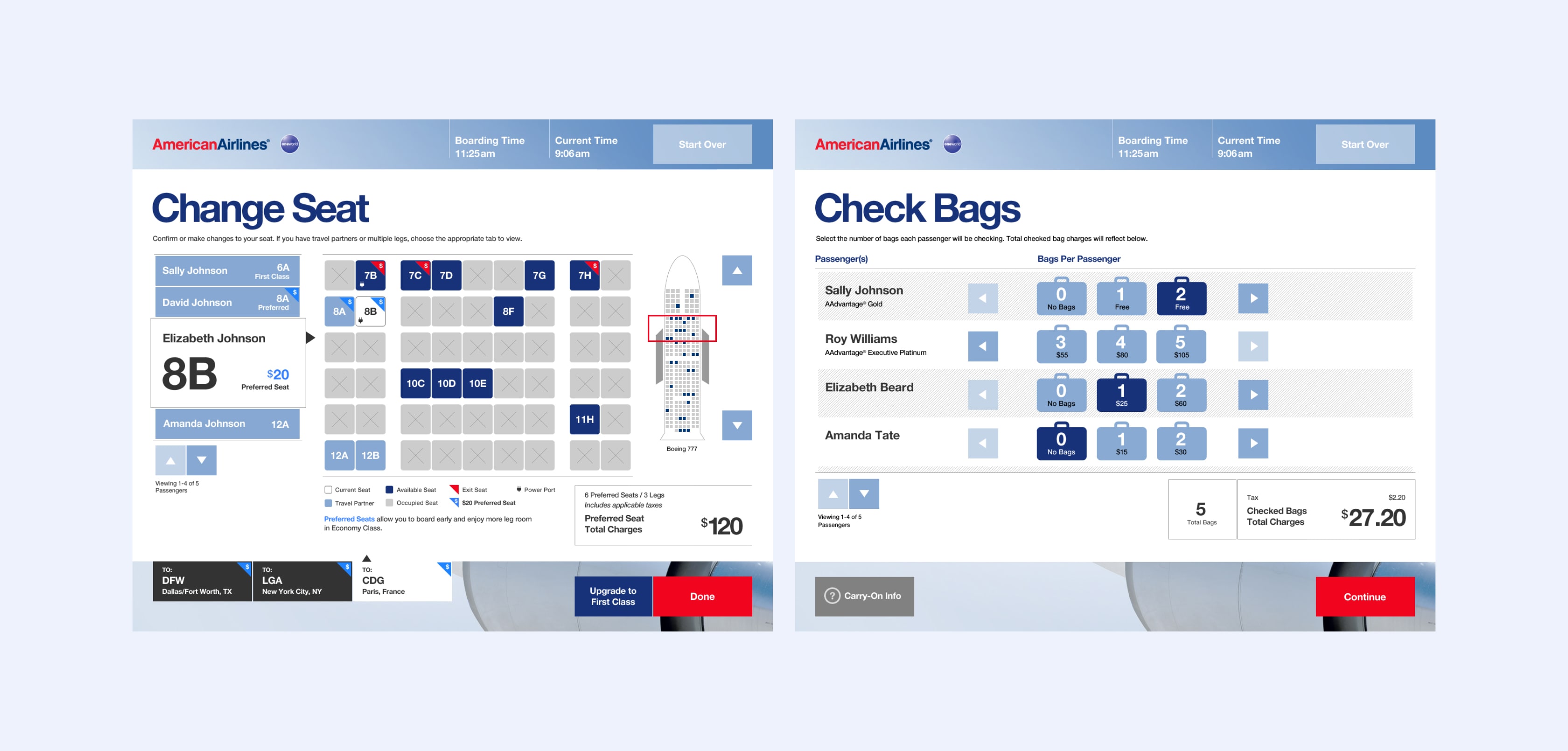
While the tasks and options appear overwhelming at first glance, we sorted and distilled them into four main buckets: Find Reservation, Itinerary Confirmation, Check Bags, and Confirmation. Then, we carved out the primary path, with optional, secondary tasks to explore for users with interest and time.
Negotiating the final flow
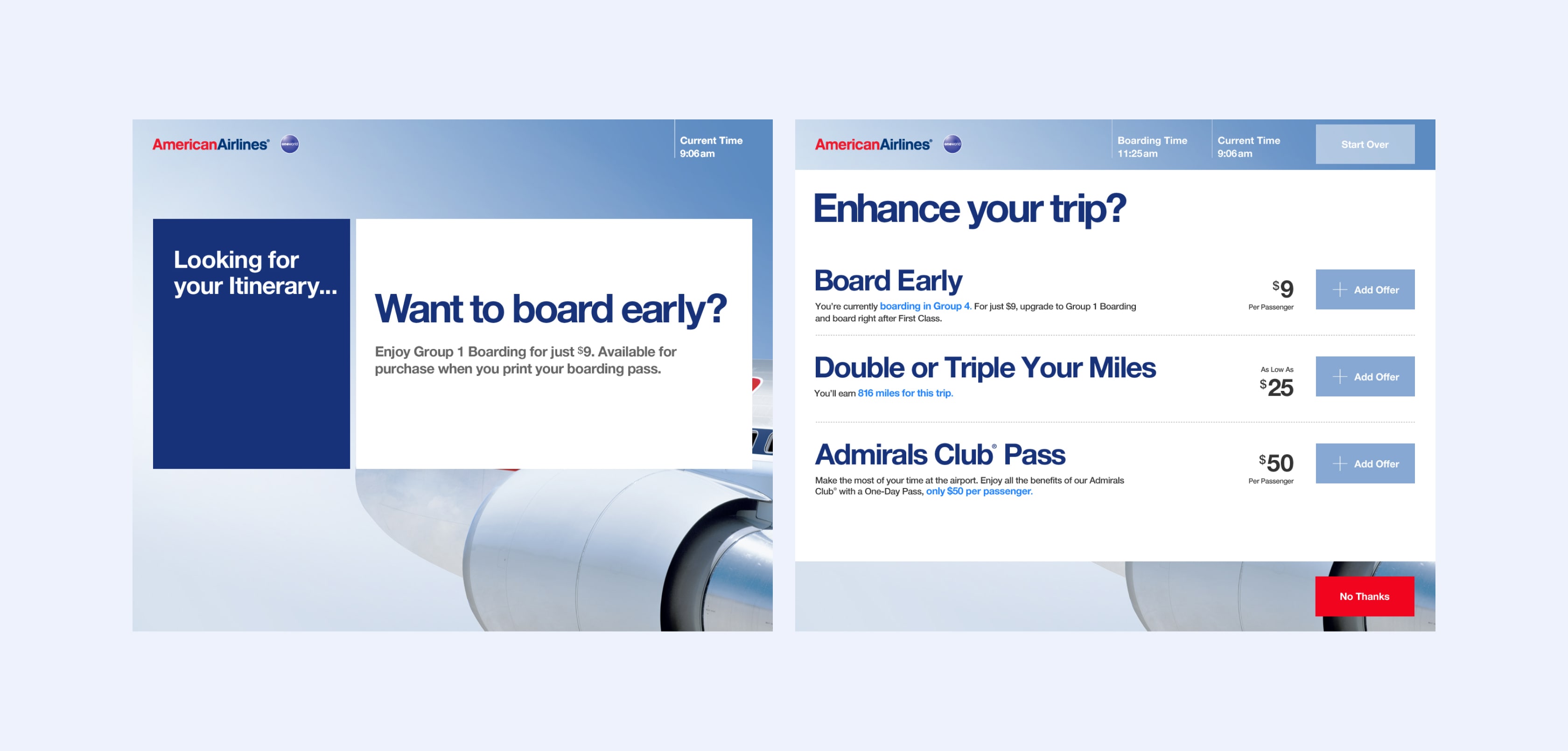
Our team received pressure to add additional steps to the process. Instead of completing the ask to return to the original nine steps, we came up with the idea of introducing merchandising options as interstitial moments while the system was processing the next transaction screen. Since we were going to be running on old hardware which needed time to pull and process data between screens, we could use that time to display upsell messaging.
UX & visual design
Bold. Engaging. Intuitive. Thoughtful. These were the adjectives with which we focused our design efforts. We created two directions that prioritized a clear hierarchy and approachable UI.
Direction 01
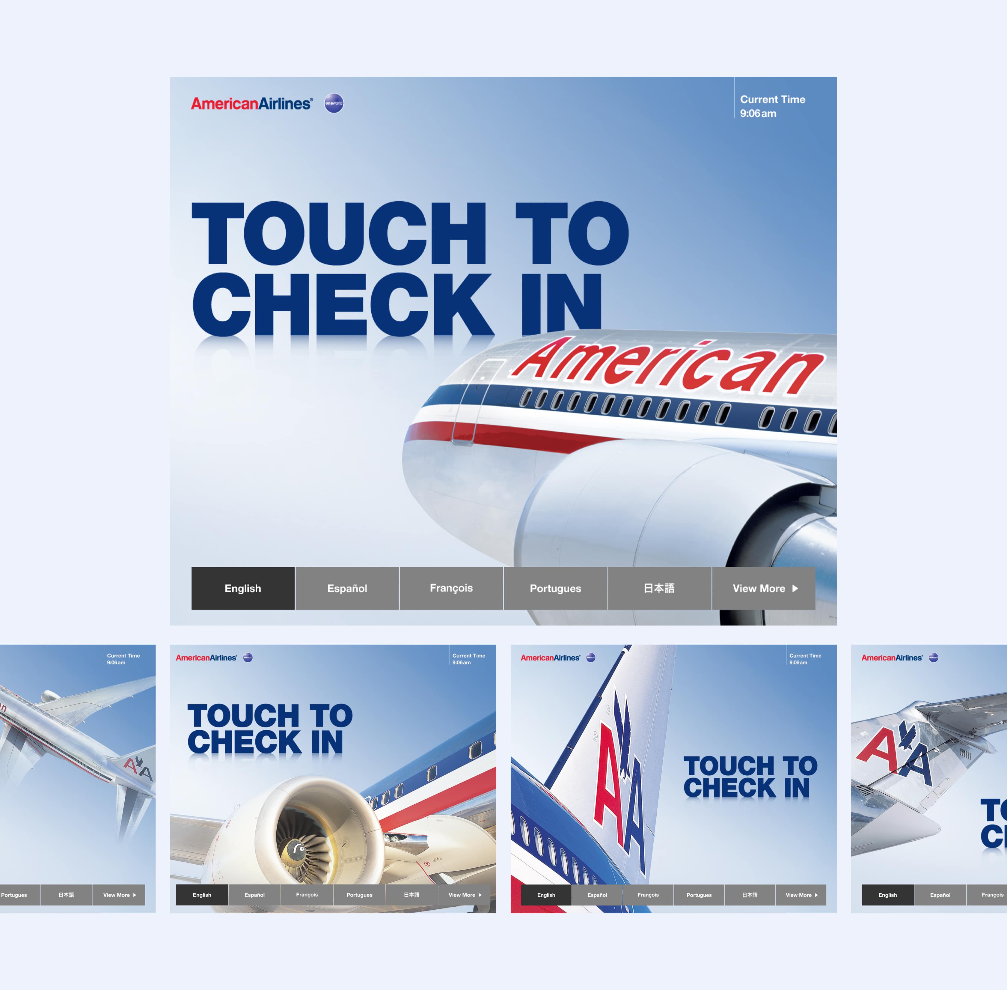
At the time, American did not paint their aircraft. Iconic steel, along with bold red, white, and blue stripes along the sides of the planes, separated AA from the pack. We created dramatic crops of the planes, along with a muted steely-blue background, then complemented the look with crisp white content cards and bold blue headlines.
Direction 02
This direction focused on the destination, rather than the aircraft. Attract screens that diplayed real-time American flights made the check-in experience feel both dynamic and connected. Bold typography was proposed for decision points, and color blocks were used to denote sections and screen hierarchy.
The way forward
The client chose direction 01, with a few visual updates to color, as well as adding text reflections which had somehow made its way into this iconic brand's style guide. My goal was to keep the spirit of the design alive, even though it meant giving up a little ground on a few of the visual touches.
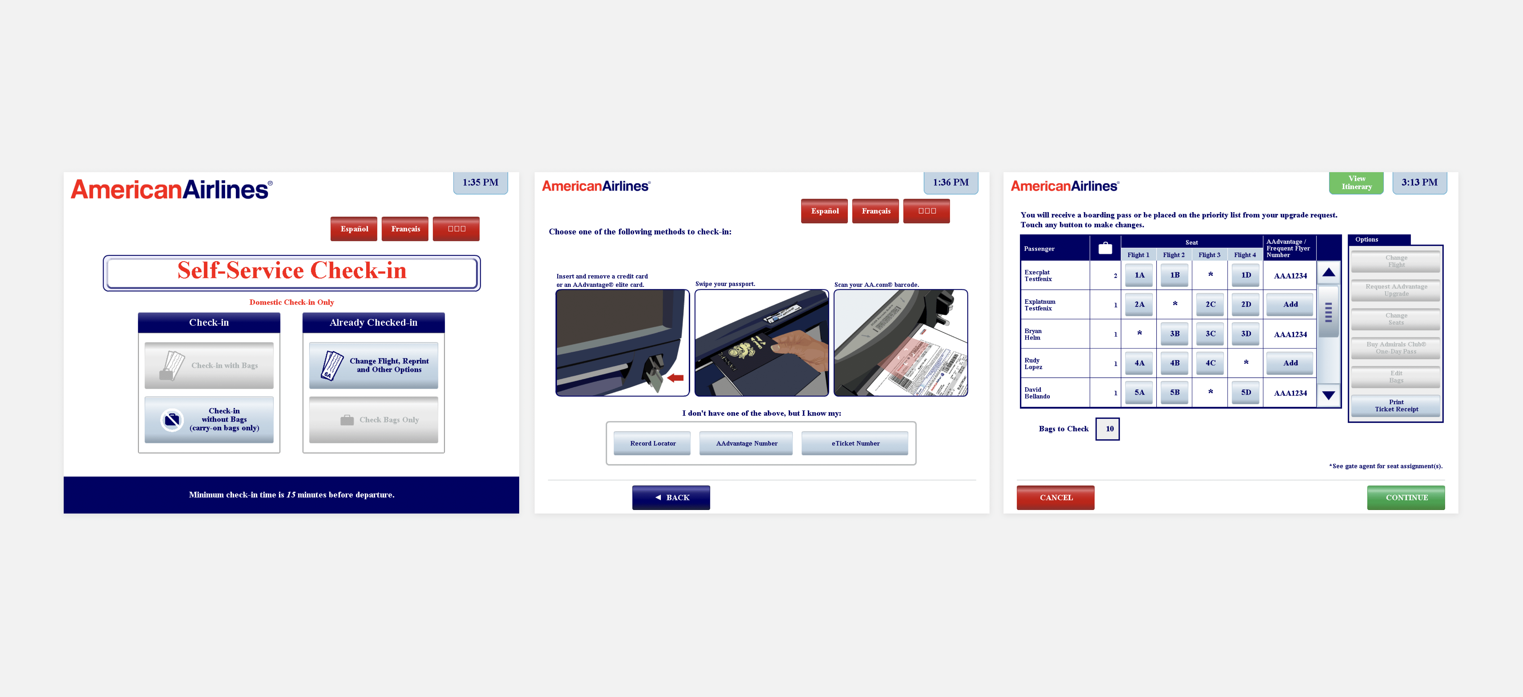
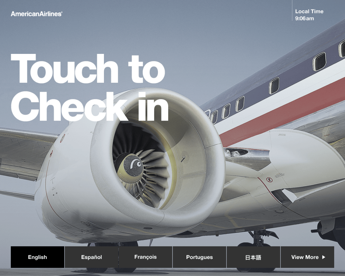
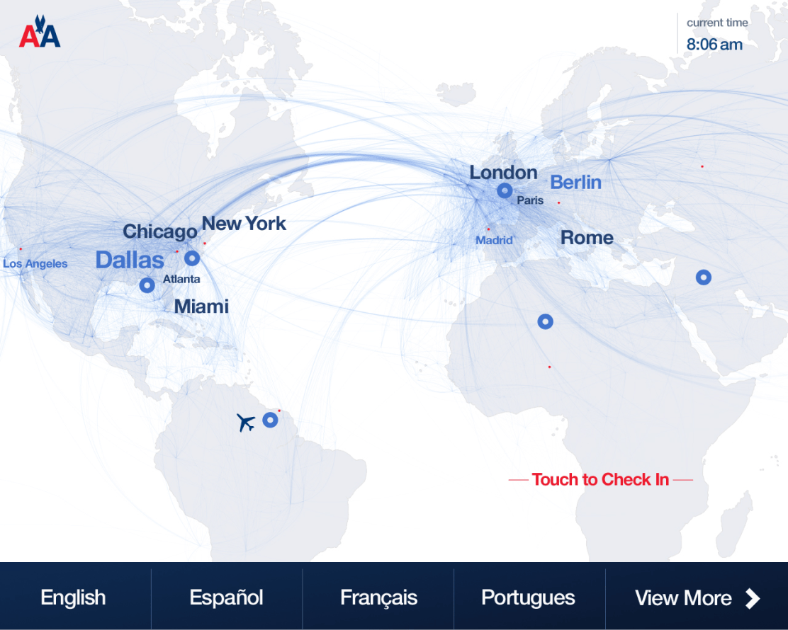
Attract Screens
We designed a series of brand-forward screens to draw in the user as they approached the ticketing area. Each screen gently animated between five images.
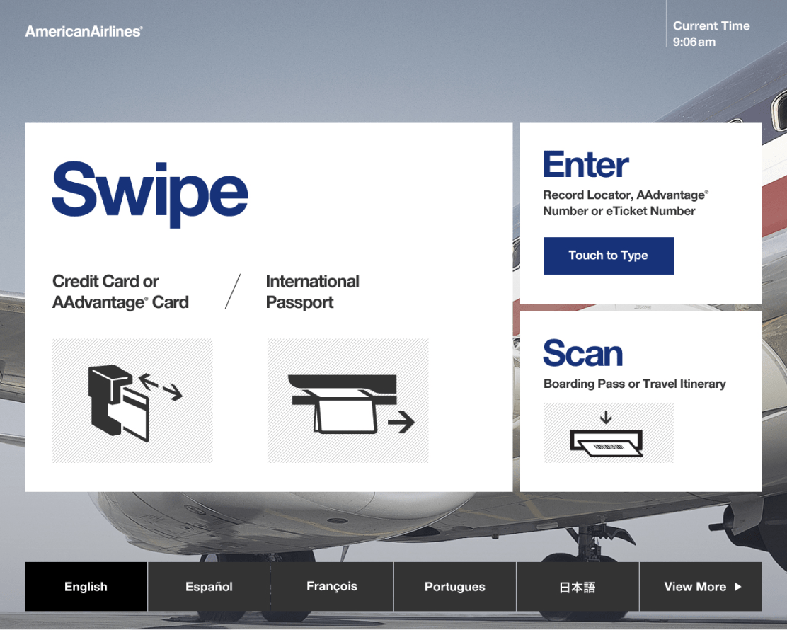
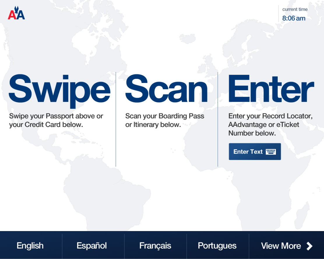
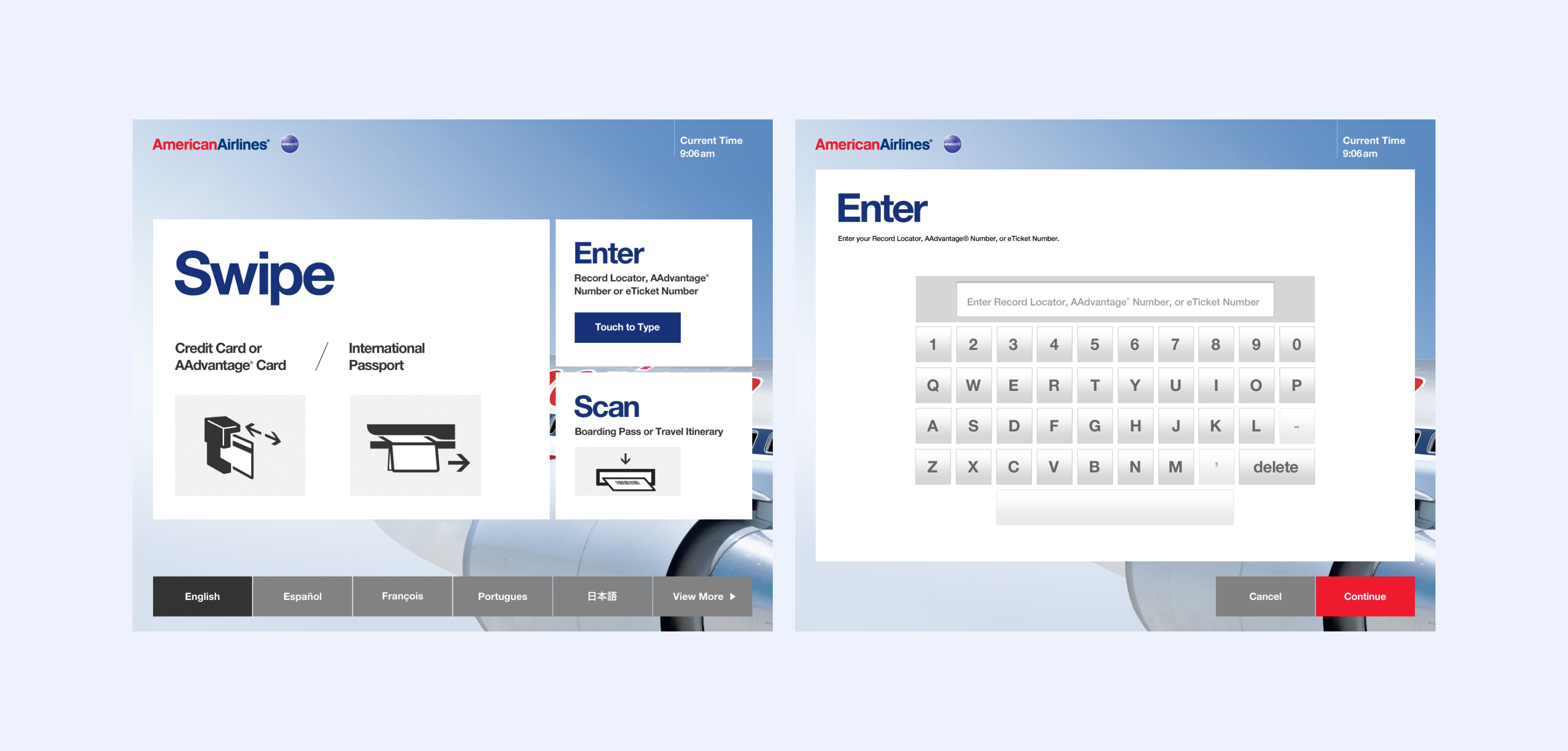
Intuitive decision points & inputs
We simplified the decision points by creating a well-structured visual hierarchy. Each screen was designed to have a primary job, allowing users to focus on one task at the time.
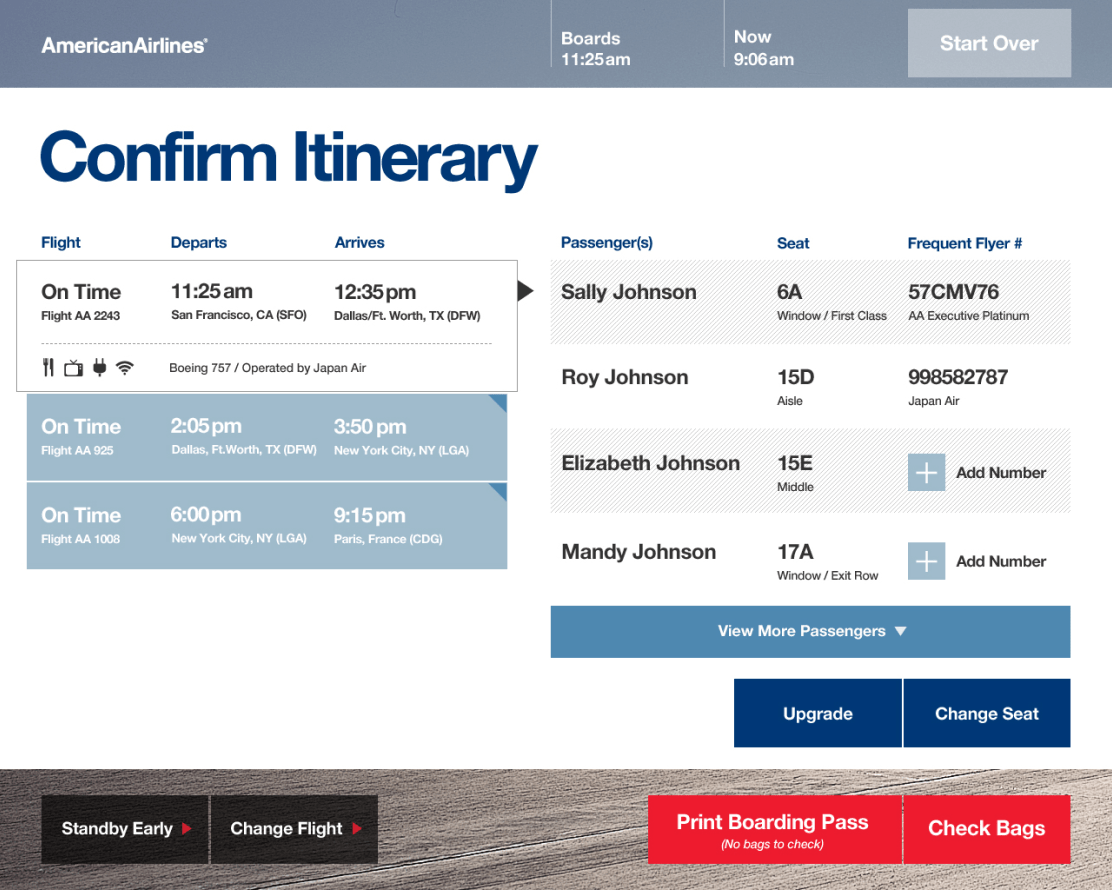
Content designed to scale
Each screen was presented as content cards, with the ability to scale in both size and complexity. It was important that each screen, regardless of complexity of content, feel considered and intentional. While most itineraries contained four or fewer travelers with a direct flight or a single layover, we designed the system to accommodate the most complex use case: Eight travelers with three flight legs.
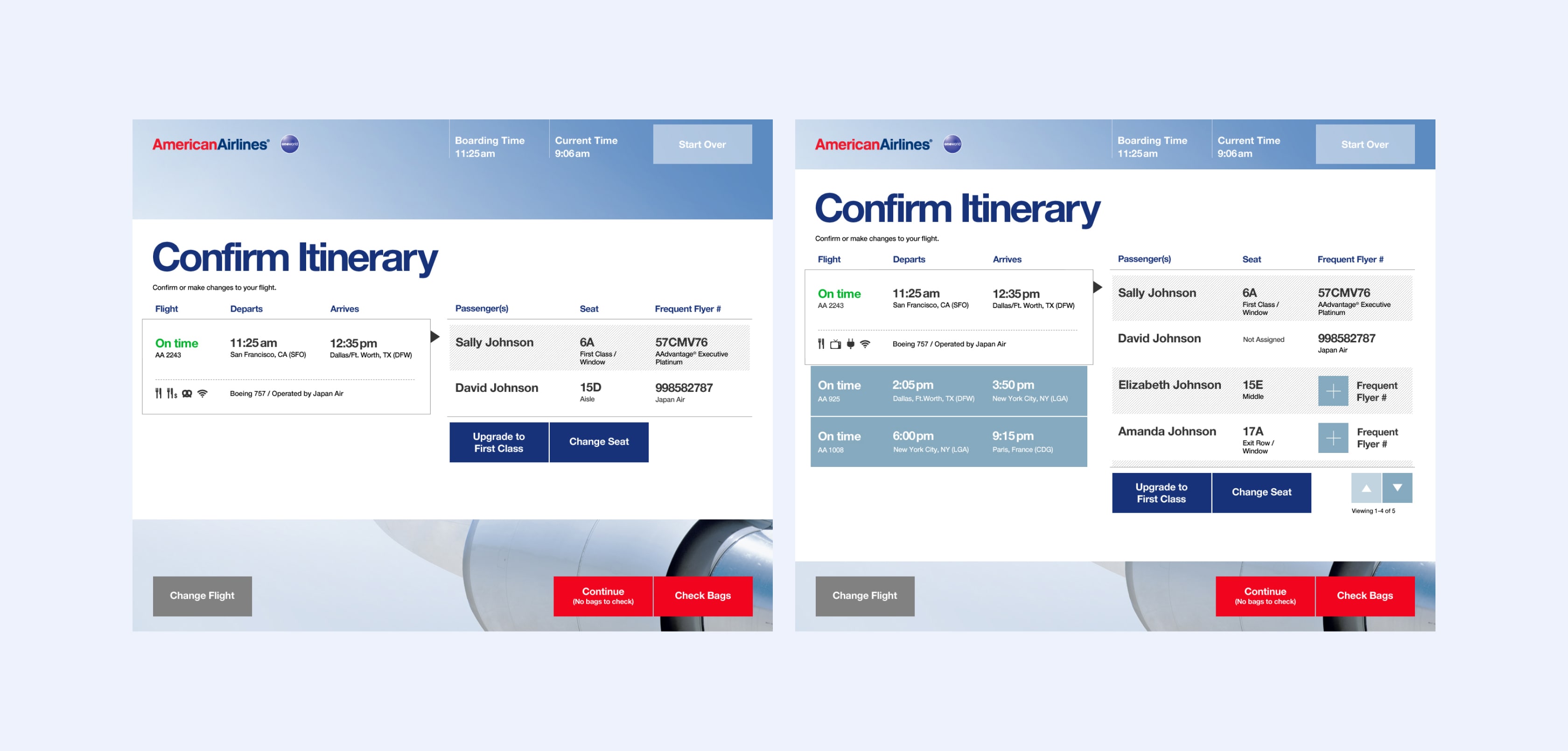
New territory
At the time of this project, the airlines were just beginning to formulate their strategies to charge different rates for seats in coach. Exit Row seating, Preferred seating, and seats with charging outlets were all accounted for in the design.
For the Check Bags screen, we originally designed the interface to have six icons across (0-5 bags to check) with pricing for each option. One of the points we were forced to concede was to show only the first three without touching the right arrow to reveal additional options. American was concerned about displaying all pricing together, as they felt travelers would suffer from sticker-shock.
Trip enhancements
Merchandising opportunities were presented early in the flow, while the system compiled data to show on the next screen.
We designed Trip Enhancements as a single screen near the end of the primary flow. This was done to help the traveler maintain momentum on core tasks, and present opportunities when they are more apt to indulge in extras.
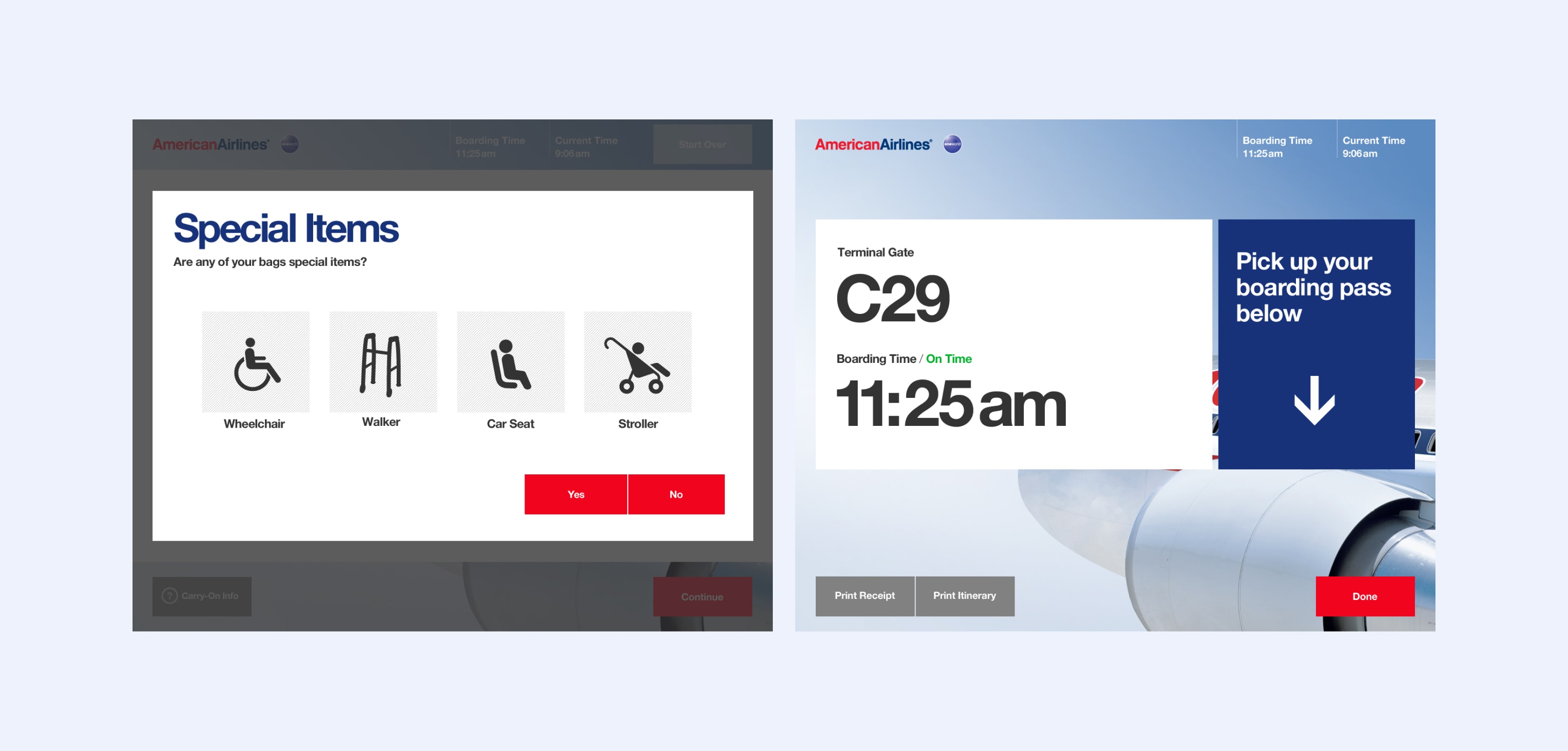
Guidance at key moments
For Special Items, we displayed icons for for quick and easy scanning. At the end of the flow, we displayed the flight gate, boarding time, and flight status while the traveler waited for their boarding pass(es) to print.